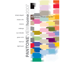
Showing posts with label Color. Show all posts

Trends for 2008

I have been looking at the design "trends" for 2008 while we source new products. I've tracked the "hot news" from Europe back to the states. What I find really interesting is how the new products are presented - it's a treat to take a look at what's coming next. Since I love color and furniture I do like to see what's new; but I still prefer to do my own creative thinking; so I am using the list of trends for a creative jump start instead of fully embracing and copying them. So here's a glimpse of what I have seen for design and color in 2008.
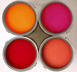
Expect more color

We're seeing products that run the color spectrum - these are more vivid colors than we've seen in 2007. In fact, 2007 was all about neutrals, so the industry has almost done a complete revamp when it comes to colors. In a trade preview, we noticed that Pottery Barn has completely dispensed with the darker neutrals and features a rainbow of bright and bold color in their 2008 product line, using white and ivory as the backdrop to let the colors pop. We've also noticed a trend to use color in combination with greys and silvers.

Benjamin Moore has a paint line that corresponds with the Pottery Barn Products. So if you're interested in doing a feature wall in a bold shade, check them out. They still have more blues and greens, than they have reds and yellows; so don't worry about going with a color that is too overwhelmingly bold for your space. The greens and blues are still relaxing colors to use. I am anxiously waiting for the Yolo Colorhouse 2008 color collection to see what they are up to.

Graphics

Ok, so if you haven't noticed in 2007 there were a lot of graphic patterns everywhere. This continues into 2008. They are lovely, but this is an area that I think has the potential to be compared with the Avocado Green and Harvest Gold kitchen appliances from the 70's. So, because I do like the graphic patterns, I may invest. But not in a carpet - I'd go for the wall decals in a bold but removable graphic.

Eco-Friendly Design

This isn't going anywhere, at least as long as there is a threat of global warming - so I'm not sure it can be called trendy. Still I thought we should highlight this here as it is a growing segment of interior design. To highlight, we should be demanding that our products are:

  1. from sustainable, reclaimed or recycled sources
  2. energy efficient
  3. chemical and pesticide free
  4. fairly traded
  5. comfortable and beautiful
Eclectic Looks

When we hear the word "eclectic" in design we may think of a collection of unmatched furniture, and personal decorative items which are brought together to create a stylish room. Though I think it also encompasses global fusion and the melding of design styles like country and urban. This is the preferred way to design in my book - turn things around and make a personal statement; so I am glad it's being highlighted in 2008.

Ok so back to my remark about the Avocado Green and Harvest Gold kitchens. At one time or another someone decided this was trendy. hmmm. I'll just wrap by reminding you that there are no rules, do what you love!

Happy New Year!

Lise

Evaluating Fabulous Products


I have spent these past few weeks evaluating products for a couple of new online e-tailing ventures. (more on those later)

Yesterday I received a beautiful package of paint colors. Thank you to Laurel from YOLO Colorhouse for sending me these fabulous family cards. Laurel is great.

It's a wonderful feeling when you absolutely know what you're meant to do with your life. I could literally not help staring at these vivid paint colors and envisioning where I can use these. This package made my day. So much potential. Such a wonderful product. I especially love the Petal and Sprout pages. I think these colors are so beautiful - especially when used in a child's play or work space! (or even used for an adult with a childlike outlook :-)

In all honesty, the YOLO colorhouse company has done an amazing job with the presentation of their products. Their website is awesome, but the colors on these pages are not to be missed. And any walls with these colors have got to be just dazzling. So my next step is to try a can of paint for one of my upcoming projects. Can't wait.

Be creative!

Lise

Inspire Me Thursday - Limited Palette


Hi!


This week at IMT, the topic is limited palette. In working on an idea for a few ATCs, I used the limited palette on the left. (The pale jade and grey colors on the right side of the card aren't scanning well)


After the palette was fixed. I made the surface design (first image) for the two coffee cups and applied it to the cups, altering the perspective a bit.


surface design


cup 1


cup 2

Enjoy!


Lise


Inside Design - Mood Boards


I am choosing new colors for a dining room project. The room I am designing is located near the front door of the home, and is one of the first areas on view as you enter. I wanted to build a vibrant room; making statements with the colors and graphic patterns. I love the palette so far. It was inspired in part by a simple quote - Bloom where you are planted; and also by the blend of colors in the small seashell.


Beyond color, this design will also incorporate creativity in strong doses. There is a graphic yet subtle wall design plan. Along with a paint-on-canvas project. I'll also add some custom pillows and add colorful trim throughout.

As for function; I want the room to be used year round, not just for special occasions. I've decided to have it work for both dining and reading. I want to use two over sized, dual-purpose, reading and dining chairs near the window. I like the texture of this particular chair. With the high back and clean lines it definitely makes a statement and provides a little shelter from overexposure near windows. I'll cover the cushions with a bold- patterned fabric in a color that will contrast with the other colors I have chosen already.

Shopping for the tabletop will be fun. I am thinking of a really clean white on white modern pattern for the dishes. Square - not circle. And a funky coral centerpiece with candles for a moody and mod atmosphere.

For this project, I will also need to cover a decorative inset on the wainscoting. I'm thinking of covering the panels with fabric too. You can apply fabric to the walls using liquid starch.

The complete design will be available through our Jump Off Design™ program at the end of September. Jump Off Design is a limited edition design service for do-it-yourself types in need of a bit of inspiration. The "design-in-a-box" kit includes specifications for furnishings, paints, and materials. It also includes detailed instructions for completing the special wall & window treatments, pillows, and simple upholstery projects.

This is a limited edition product, and as such, will not be widely distributed. Please contact us for information on pricing and availability - or to request a custom design.

Enjoy!
Lise

New Workshop Leader

I meant to tell you all about a newly licensed Artistic Lifestyling instructor. In addition to design services, Marja Chapman will be teaching Fear of Color Workshops in the Washington DC/Northern VA area. You can reach Marja at her website for information on her schedule.

Cheers!

Lise

Style Points: Silk Paint & Home Furnishings


So in a previous post about milk paint, I received quite a response both on and offblog. Who knew it was such a popular topic?!? So this week I though I'd take a quick look at silk painting and it's use as a decorative home furnishing.


One of my planned projects is of a brownstone building on silk. Brownstones have always been one of my favorite architectural images. Painting this particular image on silk will give the building an interesting finish; mostly because of the resist. Once the silk is painted, I'll frame it within a border of richly-colored velvet fabric; not only to compliment other dye colors chosen, but to give it weight as a wall hanging.


To paint on silk you'll need the following basic materials:


Silk painting doesn't require an extensive art background. It's pretty easy because you use the resist to outline your pattern, and use the dye to fill in the lines. Painting on silk is similar in some ways to watercolor painting because the dye tends to spread on the silk in the same way that watercolor spreads on paper. But it doesn't spread beyond the resist (gutta) lines. The color of the dye tends to show up very vividly; making a striking addition to your home decor.


If you want to give it a try, visit this link for more information; I've found that the directions are very comprehensive.


Once you've made a few silk scarves, try creating the following projects to decorate your home:


  • Custom Decorative Pillows

  • Screens to divide rooms

  • Wall hangings -Both large quilt-sized pieces, to smaller framed or unframed silk scarf size

  • Lamp & Chandelier shades

  • Art

  • Custom Drapes (Silk is a delicate fabric and will fade. Drapes should be lined to give weight to the silk)


Resources:

Workshops:
Books:

Style Points: Milk Paints

This week I'm exploring paint colors for new walls. My favorite of the moment happens to be milk paint. I like the low-luster of the paint. A completely flat finish that will do well to hide wall imperfections. It is also one of those paints that won't come off easily, so it's best to do your research and a bit of experimentation.

Milk paint can be created using simple ingredients at home if you wish - this is one historical recipe:


  1. Powdered pigments or universal tinting colors, in the color of your choice
  2. Non-Fat Dry Milk
  3. Water

Finding the exact color you want is sometimes a trial and error process. Try creating a small batch first by using 1 cup of powdered milk with a small amount of hot water. Add the pigment or tint to create the desired color. Take careful notes about how much tint you used for the mixture. Once you have the color just right, test on a sample board and then mix up a larger batch.

Some recipes for milk paint require the addition of 1 oz. of hydrated lime for every quart of liquid. You are cautioned to use only hydrated lime and not quick lime. Hydrated lime will not react with the water.

Though I like to experiment with the colors you can obtain from the pigments. If you don't wish to experiment, milk paint comes in powder form as well. All you need to do is add water.

Milk paint can be used on walls, cabinets, furniture and craft projects. It is often layered and used with glazes. It can be used on non-porous materials, but you may need to add an extra product to make it adhere better.

__________

Be Creative!

Lise

Style Points: Color Trends


Every year, Pantone creates a list of the top fashion colors for the coming year. This year the company has forecasted 72 standalone colors and wonderful combinations. These color choices will dictate home and fashion products in the next several months. They will appear in pillows, wallpaper, appliances, and now Pantone has even created a delicious line of paints.

For anyone considering a new paint color for their environment, please ask your designer to show you the expanded collection of palettes!

Here are the Pantone Color Institute's top 10 modernized colors for next year:

SILVER PEONY
TARRAGON
OPAL GRAY
GOLDEN APRICOT
HOLLYHOCK
GREEN SHEEN
GRAPEMIST
CAFE CREME
STRAWBERRY ICE
SKY BLUE

If you're interested in taking your color selections a bit further, I am conducting a complimentary online color workshop in the next few months. Send me an email and I'll add you to the participant list.

Enjoy!

Lise

Happy Mother's Day!


I hope you are enjoying your Mother's Day!

We are taking the day to be creative. Download the picture and be sure to color outside the lines!

Lise
_________________________

I See Me! Personalized Children's Books

Creative Play

  Posted by Picasa

Trouble choosing color?


I have friends that are so afraid to choose wall colors that they will live with white walls forever. And really, I'm all for taking your time and choosing carefully. But there comes a time when you really need to stand up straight, take a deep breath, and choose a color or two.

Here are some ways to take the fear out of selecting your wall colors:


- Forget pictures

Look for inspiration in real life. Go outside to choose colors from nature. Prefer the color red? Look in your kitchen or at the grocery store. Search for tomatoes, beets, cherries, spices, pomegranates. You name it - just BE CREATIVE! The more samples you collect, the more confidence you gain. The process - well, it's fun - I promise. And the benefit in choosing colors this way is that you won't be at all intimidated by a piece of fruit. Though you might be by some very posh designs depicted in the pages of a magazine.

- Forget perfection

What may happen during this process of selection, is that you purchase a can of paint, put it up on the wall and find out that you hate it. Aside from the cost of the paint and your time, you can always start over. But please live with it for a few days though before you repaint and decide what you don't like about the color, as well as what you do like about it. This will help you tremendously when you decide to fix things. If you don't want to make a commitment of time or money, choose a company that offers small paint samples and paint one or many samples in a large area on your wall, and then decide.

- Forget the rules

Trim does not have to match from room to room. Wall color doesn't either. Please experiment, and make it your own.

Creatively yours,

Lise
_______________________


  • Great Selection of Decorative Hardware
  •